There are essentially two ways you can discuss the quality of software. External quality is something everyone can appreciate. For example, how easy it is for customers to use one of our products and whether they encounter any problems (bugs) whilst doing so. Internal quality however, is a lot more complex and tricky to get right, but is just as important as external quality (if not more so). To me, internal quality is about how efficiently you can add or modify functionality whilst not breaking any of the existing functionality, not just today but over a long period of time. This is also known as the cost of change.
Another well known term  is software entropy – the more you add to and change a piece software the more complex and difficult it becomes to do so. Eventually the cost of change simply becomes too high and the long and arduous task of replacing the system begins. Of course, doing this this has a massive impact on competitiveness as you’re unable to deliver new functionality until you’ve done so and why it’s so important to make the effort to keep your code in good condition.
In the new world of software development we’re all really keen on visualisation (or “information radiators” as we’re supposed to call them) and with good reason.  It aids conversation and helps identify any pain points so, as a team, we can focus on removing them. A while ago a former colleague and friend of mine Peter Camfield blogged about quality dashboards he and Josh Chisolm had been working on. We’ve recently implemented them at my current company as well. I’d like to go into more detail about the dashboards, some improvements I’ve made and how, in combination with other visualisation tools, we’re able to make the most of them.
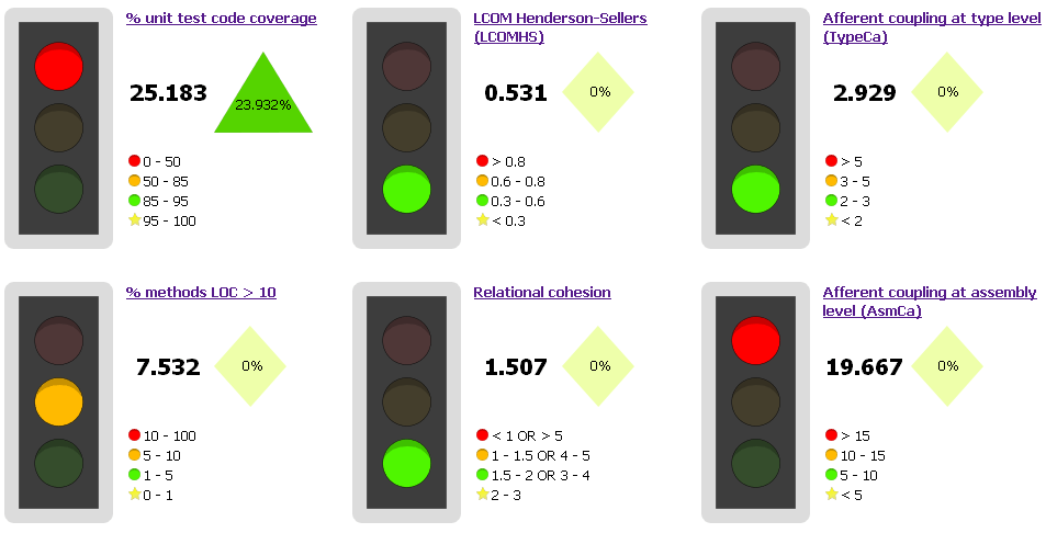
The dashboards are created by running NDepend CQL Queries* and NCover on the code and test assemblies for a project, aggregating the results, comparing them to previous recording and outputting them as a set of traffic lights with arrows to show whether the measurement has improved or worsened. The levels at which the traffic lights change colour are mostly based on recommendations from the NDepend Metrics Definition page.
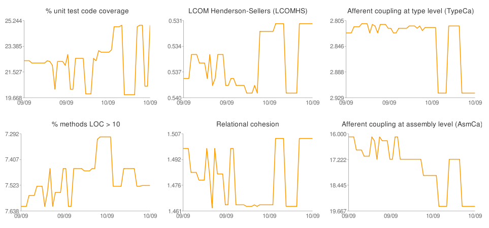
 We’ve been running them in TeamCity (and added the output as a tab)Â any time code is checked in. Having lived with these dashboards for a while now I can say I’ve found them invaluable. They’ve raised countless discussions around how changes to the code base have impacted the metrics and really made us think about what good internal quality is. However it’s also been frustrating as until now they’ve only shown changes from one build to the next, so I’ve recently spent some time working on adding line charts (using the Google Chart API) to show how the metrics have changed over time:
The line charts are configured so that “up is good”. They give an immediate (albeit subjective) view on whether the internal quality is improving. We’ve only had these for a few weeks and it will be really interesting to see how easy it is to get all the lines to go up or at least remain stable** and whether improvements in the metrics are reflected in the cost of change.
In part 2 I will talk about how we can use these reports in combination with other visualisations to help us understand how code modifications affect internal quality.
* It would take a long time to go into the detail of the CQL queries suffice to say they were chosen to try and give the broadest picture of the condition of the code without having so many that it just becomes a noise. ** From the small experience I’ve had so far I don’t think it’s going to be very easy.
